This post is going to be going over our very last dedicated Fantastical Creatures session. I got two main things accomplished this session: brought Skollcrabb's textures back into Maya from Substance Painter, and made Skollcrabb's turntable. First, I'll start with the texture reapplication. This was a kind of fiddly process, involving a lot of different nodes in the material pop-up menu. I applied each relevant texture file to where they needed to be, following the tutorial Jon had written. It all seemed like it wasn't working as I went further in, but when I pressed render, Skollcrabb's textures were applied! I'm so glad this worked, as I was worried it would all go wrong.
Once I had a fully textured and renderable Skollcrabb, it was time to make him a turntable. We were given a turntable template file, which had a spinning disk that spun 1 full rotation for exactly 5 seconds. I had to reference the Skollcrabb into the file, and then parent it to the spinning disk. By doing this, whenever the disk moves, the Skollcrabb would move too. I rendered the turnaround and put the .EXR file sequence into After Effects, and ended up with a nice looking turnaround!
All in all, I'm glad to have finished my model entirely! All I really have left is to composite Skollcrabb onto some still photos, which I'm really looking forward to! It'll be fun to make Skollcrabb seem that little bit realer! This session was an all around success the entire way through; nothing went wrong, and the two things I did within 3 hours were tasks I imagined would take me all week! So I'm very happy with today's work!
THURSDAY - Lip-Sync Original post: https://ncarolannua1b.blogspot.com/2019/05/lip-sync-finalised-animation.html "So now my animation is all done! I really enjoyed this unit all in all, mostly due to my own bias towards 2D animation. Getting back into it after units which were more experimental & foreign to me was like a nice homecoming, and was definitely a more comfortable way for me to work. I don't really have any major gripes with the sessions, they let us get on, and Katherine was very enthusiastic and helpful! The only thing I'd really change is keeping an eye on consistency. I feel like my lip-sync animation was very successful, and it's probably my favourite piece of animation I've done this year!" SUMMARY This week is the final week before hand in, and it's all about getting things fully finished. The lip-sync feedback has been fully implemented, and now it's finished! I'm really happy with how it came out, it hits the sweet spot of feeling like something I'd make on my own, but with the skills I've learnt since coming to university, mostly how to properly apply the principles and animating on twos. Overall, my thoughts on this project are entirely positive! I got to animate in a way I adore, and work in a medium I'm more comfortable in. My Fantastical Creature is so close to being finished at this point! The model is all there and textured in Substance Painter, I just need to figure out how to get it back into Maya with the textures all intact and applied correctly. I've got a feeling it's either going to be ridiculously easy or ridiculously difficult. But I want to make it look as good in Maya as it does in Substance Painter, and hopefully the correct application will make that possible. Then it's just a turntable and compositing to do and it'll be a wrap for Fantastical Creatures!
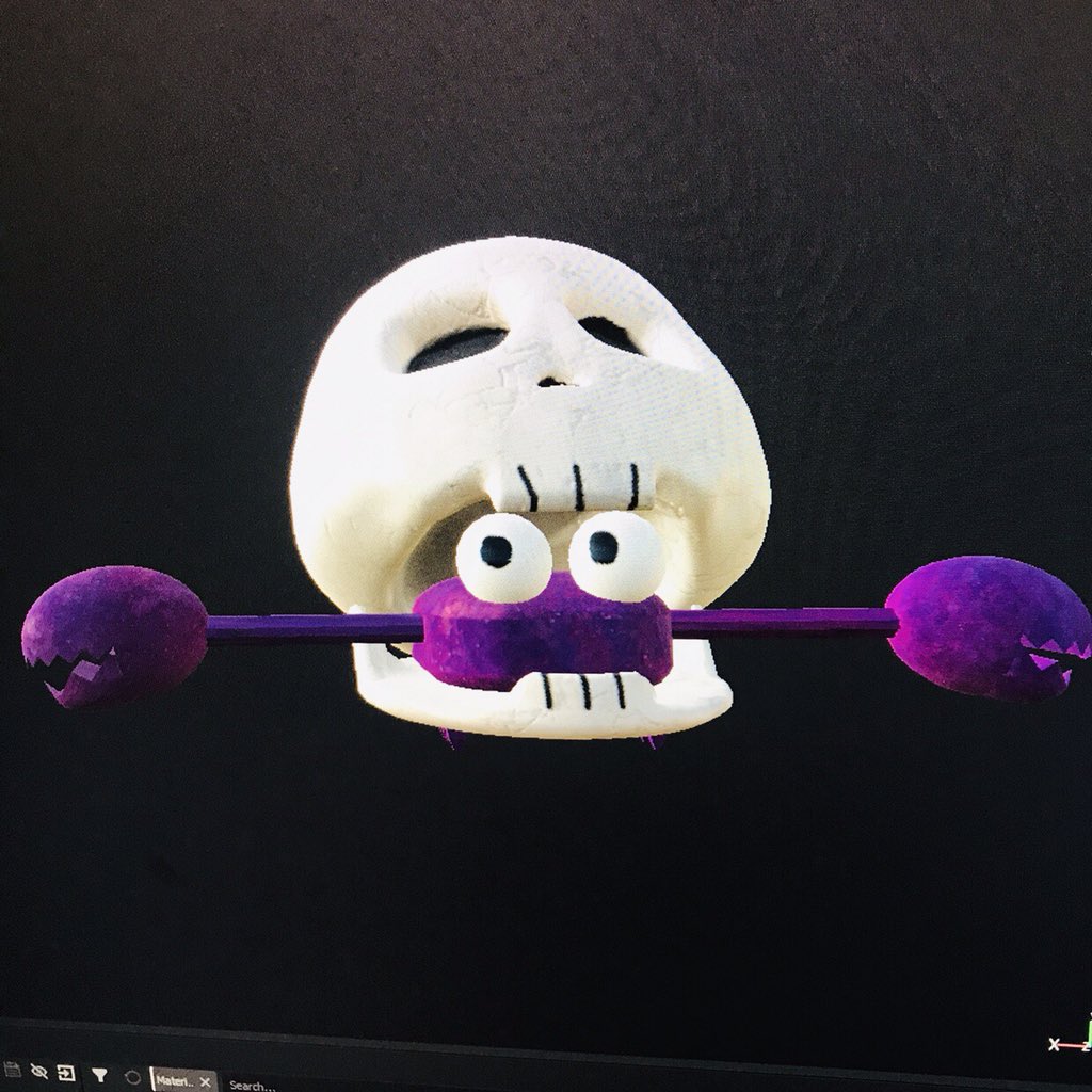
In this post, I'm going to go over how I textured my Skollcrabb creature. After getting feedback yesterday on how to bring my model into Substance Painter properly, I started to work on getting my Skollcrabb model finished. The main feedback I got was on how the seams worked on my model's UVs. Before when I brought it into Substance Painter, all the seams were auto-generated. That meant there were a LOT of faces created from the seams, and drawing on one of them copied it to every face. So I took each object and worked on each UV again from scratch. I made sure to create enough seams so that when I added a texture onto the shapes, the images wouldn't be stretched out. It was a quick enough process, and finding out about the Layout function made rearranging the UV shells a lot quicker and easier than I thought. I then applied different lamberts to each object that would have a certain texture on it; the skull & jaw would have one, the head, arms, claws & legs have one, and the eyes have one. That way, when I bring it into Substance Painter, each group of objects under one lambert would be grouped together. And that's exactly what happened! I had three layers set up at the start, which I nicknamed "BO0O0O0O0ONE!!!", "eyes" and "shell". I tested dragging textures onto different areas of the Skollcrabb, and sure enough, only certain areas got affected; the ones grouped together! From there, it was a process of finding the right look. I messed about with two main textures for the skull & jaw; a preset for bone that looked like bone but didn't give off the exact effect I wanted, and a matte porcelain preset with a cracked texture. I ended up going with the porcelain one, since the cracks looked a lot closer to what I wanted. I was also able to change the base colours, so it'd look more like off-white, signifying the age of the shell. The actual shell body underneath the skull was textured using a rust preset. It gave off a battered, layered look, which looked really nice when I changed the base colour to a dark purple. Finally, the eyes. These were by far the easiest to texture; white gloss with drawn on pupils. While I was drawing on the model, I also added 2D looking eye holes, nose hole and teeth. And in the end, the Skollcrabb model looks like this:
I'm REALLY happy with how it turned out! This is exactly what I envisioned Skollcrabb looking like in 3D with textures, and it's the first time I've taken one of my characters and made it 3D, so it's a big deal for me! I'm glad that after so much trial and error, I have a textured Skollcrabb that looks as good as it does! Next step from here is bringing the textures back into Maya and creating a turnaround, as well as some composited images.
This post is looking at my final lip-sync animation, which I've been working on in TVPaint. Last lip-sync session, I got feedback from Helen on how to improve the animation, which is to retain consistency better. The hair and hairline was the main issue, with the hair changing in shape & volume little by little, and the hairline having a jittery effect to it. I fixed this up by just doing the head all over again, starting with a new rough animation layer and then doing lineart again. And within the session, I was pretty much done.
So now my animation is all done! I really enjoyed this unit all in all, mostly due to my own bias towards 2D animation. Getting back into it after units which were more experimental & foreign to me was like a nice homecoming, and was definitely a more comfortable way for me to work. I don't really have any major gripes with the sessions, they let us get on, and Katherine was very enthusiastic and helpful! The only thing I'd really change is keeping an eye on consistency. I feel like my lip-sync animation was very successful, and it's probably my favourite piece of animation I've done this year!
Today, we had our actual real presentation of our findings for the Media Roles research task. We've spent time putting our slides together, making one cohesive presentation. We all worked on our individual slides, then established a uniform look and format.
(Our final presentation we showed)
We were alongside groups 1 to 4 for a morning session, where we all presented to each other, as well as Peter, Helen and Jon. I felt quite nervous, since I was worried that I'd mess something up during the presenting, or that I'd done something wrong in the slides that I hadn't caught up until then. But when we finally came to actually present, it went pretty well. We established an order for who would say what:
I would start by introducing the presentation and explaining what area we looked into
Tanje would take over talking about the pre-production pipeline, and her slides on Monsters University's production design
I would then go on to talk about Moana and character design
Gareth would talk about Blur Studios and 3D character modelling
Jacob would talk about Ori and the Blind Forest and it's art direction
Tom would talk about Spyro and the 2D to 3D process
We'd all read the conclusion on what the biggest thing we took away was
Now, I say the presentation went pretty well. Why not good or great? Because I feel like members of our group wasn't 100% there. The presentations of each others slides started to dip in quality, and in some cases, it was clear that more rehearsal time was needed. One person spoke for too long, speaking more about the studio than the actual area he was meant to be talking about. Gauging reactions afterwards from audience members, I found they also found he went on too long. Another person went too quick, and was incredibly quiet so barely anyone could hear him; I was up at the front with him and I couldn't hear him. I feel like my slides went well, which was further affirmed by Peter and Helen bringing up me and my points directly when getting positive feedback on our presentations. Both Tanje and myself got positive feedback on how we seemed to be leading the team well. In my head, this did make me glad; for most of this project, it felt like the two of us had to carry the team a lot, so it was nice knowing our hard work getting everyone together paid off. Now that the presentation and research task is over, is there anything I'd change? Yes, a couple of things. First off, the presentation itself. I'd want to make sure it was all prepared a LOT better in the start, and that everyone was on the same page. Looking at all the slides put together, some of the less vocal members definitely didn't get the format as much as others, which lead to a lot of reformatting and trimming down. Making sure everyone's got the same idea is essential. Another more personal thing I'd want to change is adding a little bit more, for lack of a better term, showmanship to the presentation. With the other groups, they managed to get a few chuckles and laughs from making little jokes and adding funny things into their slides. I tried to get some kind of reaction from the audience twice through what I was saying, in an attempt to keep audience retention; they laughed once. If I had to do this again, I'd definitely want to make a more engaging, entertaining slideshow. Finally, the biggest thing I'd change is getting the group presentation ready. It was clear that not everyone was ready for this, but for more than just nerves. Unpreparedness and a somewhat lack of interest was also at play. I'd make my group more prepared if we did it again, even if it means I have to keep getting everyone together to practice. So, to reiterate my aforementioned feelings towards this presentation, it all went pretty well. And that's about it.
This was the first session back after Easter, bringing me back to the Fantastical Creature modelling! Over Easter, I thought I'd finished my Skollcrabb model, filling all the necessary gaps and fixing anything that didn't work so well. But the key word there is "thought". As it turns out, when I imported my Skollcrabb into another program, it came up with a LIST of errors. I got Jon to give me feedback on the model, hoping he could point out what was wrong. His main feedback was to do the skull again, since that seemed to be causing me the most problems. The skull had gaps in the mesh, vertices & edges weren't meeting, but my biggest downfall was my polygons. I'd forgotten that these models had to made from 4 sided polygons, but my inclusion of polygons with sides ranging from 3 to 20 was my biggest issue. Instead of starting the skull again from scratch, Jon advised that I retopologise it. Retopology is the process of creating a new poly-model using another poly-model as reference; it's essentially tracing in 3D. You place 4 points down to create the basis of a polygon and then fill the gaps, adding to your new shape. So I got started on retopologising the skull! I also plan on doing this for the bottom jaw as well, since that also seems to be a problem area for the model. But I got about halfway through the skull by the end of this session, so I'm definitely coming back to work on it more.
This post is just me uploading my slides from the group presentation. These slides are looking at the character design process, especially how important research is and how influences hand-in-hand with research can define a character's look. It's still on Maui, from Moana.
So... contacting Jeff Williams didn't work out. He's abandoned his Tumblr after they made changes to their Terms of Service, so that means I've got to find a new Moana character design contact. But luckily, I found one in the Art of Moana book! His name is Bill Schwab, and he's the character art director for Moana.
(Schwab working at Walt Disney Animation Studios)
Schwab is an Annie award winning character designer and character art director, who started working on Disney animated productions with 2009's The Princess and the Frog. Since then, he's worked on films like Wreck-It Ralph and Frozen and shows like Aqua Teen Hunger Force. He won Annies for his work on Prep and Landing as well as it's sequel, as well as an Emmy for the aforementioned sequel. A lot of his art is shared in the Moana art book, especially his work on Moana, Tamatoa and, most relevant to this project, Maui.
(Some of Schwab's concept art for Maui - credit: Bill Schwab, Walt Disney Animation Studios)
I'm attempting to contact him through Instagram, where he posts concept art and drawings relatively frequently. I'm just hoping he'll at least see the message, and a response would be great! Also hoping that he doesn't have a specific NDA where he can't say anything about his work. We'll see. Update coming if he responds!
Instead of posting each of my articles used individually, I'm going to make a masterpost of all my articles, going into each one and why it's relevant. Links to each article will be in their titles. EMPIRE - MOANA'S DIRECTORS ON HOW THEY CREATED DWAYNE JOHNSON'S MAUI This article is where Empire talked to Moana's directors John Musker and Ron Clements about the elements that went into creating Maui. They break the character down into themes; the voice, the mythology, the tattoos, etc. Specifically, I looked into how they made the character hand-in-hand with an Oceanic trust to make sure they got the details down correctly.
"Very early on, probably in consultation with our Oceanic Story Trust, some of the feedback we got from them was that they recommended not to draw the movie in one specific culture. There were bits from different cultures that we wanted to wed together in this story. It took on its own life and grew differently. Obviously with the islands being separated at times by whatever, politics etc, the cultures evolved differently."
- John Musker
They also talk about how Maui's larger figure was decided upon in an attempt to make him more like a demi-god, who was able to accomplish the feats his myths claimed he could.
"He was short of stature because we'd read about that in some of the myths. When we designed him, we really felt that he was a demi-god. He's gotta pull up islands, he's gotta battle monsters. So we thought he was of superhero-like proportions, broad-shouldered and a big, solid man-mountain kind of a guy."
This article delved into how Maui's tattoos all have significant meaning to the Maori people, since they all come from the actual Maui mythology. The tattoos are shown off in the "You're Welcome" sequence from the film, where every tale Maui tells are all true.
("You're Welcome" from Moana - credit: Walt Disney Animation Studios)
This would be a good way to show off the dedicated research the character designers did on the mythology of Maui, and how they translated it into his actual character design. I followed this up with a look at the Genius analysis of the You're Welcome, and they went more in depth into the actual stories. VANITY FAIR - HOW PACIFIC ISLANDERS HELPED "MOANA" FIND ITS WAY This article goes more in depth about the Oceanic Trust the filmmakers and character designers worked with on Moana. This trust was made up of Polynesian anthropologists, cultural practitioners, historians, linguists and choreographers, who all chipped in whenever the team needed their expertise, or when the Trust found incorrect details.
"Musker and Clements originally imagined that the scene would depict ancient sailors decked out in traditional Papua New Guinean face paint, ornamental headdresses, and jewelry—until the Trust shut that down, pointing out that those would be hilariously impractical outfits to wear to sea."
This trust helped out on even the most minute details, from the clothes down to what the curtains would look like in Moana's house. Scenes involving Moana kicking coconuts were shot down by the trust, since it was seen as "absolutely offensive". The trust's biggest influence to Moana was in Maui's design.
"We have to put more hair on Maui’s head, because it’s very important. The mana is in the hair, the power of the demigod. It looked just like he was naked. For us, it was really important."
- Hinano Murphy
The relationship between the Trust and the character designers was vital to Maui's final look, and should absolutely be cited in the presentation. NEW YORK TIMES - HOW (AND WHY) MAUI GOT SO BIG IN "MOANA" The final article I found was on the deliberate choices made on Maui's design; most notably, his larger size. When the character was first revealed, there was some upset from Polynesian communities about how the demigod was designed.
"I have seen the trailer to this film, and I was astonished that anyone would depict Maui like this..."
- Gavin Bishop, Maori artist
This article also gives us an exact quote used to justify Maui's larger size, straight from the film's producer Osnat Shurer.
"Even in the myths where he’s small, he’s larger than life. And in animation, we’re not literal. You’re trying to find the essence of the character. We always felt that the audience needed to know right away, visually, that this guy is stronger than anybody else."
MONDAY - Fantastical Creatures Modelling workshop Original post: https://ncarolannua1b.blogspot.com/2019/04/fantastical-creatures-skollcrabb.html WEDNESDAY - Showreel Premiere Pro Induction Original post: https://ncarolannua1b.blogspot.com/2019/04/showreel-premiere-pro-induction.html "Since this was just a practice with the program, I had some fun with the titles and put in whatever just made me laugh! This little session taught me a couple of new basic techniques that're going to make the actual showreel's production a lot easier. All in all, this was a nice little session that was calm and I enjoyed it!" THURSDAY - Lip-Sync Original post: https://ncarolannua1b.blogspot.com/2019/04/lip-sync-colours-and-feedback.html "So now I have this feedback, I'm gonna work on making the head look better and more consistent! Honestly, I'm glad I got more to work on, because I feel like I worked a bit too quickly on this task. That's not to say it's rushed, just that made it in a very short amount of time. But now I have something to do with the extra sessions we have on lip-sync!" SUMMARY The work on the Fantastical Creatures project has essentially just been working on the model of Skollcrabb. I'm trying to make it look like an amalgamation of my original design and my maquette, taking my favourite elements from each one. Most notably, I took the legs and eyes from my maquette, and the bottom jaw and claws from my original design. I think from here, I just need to keep working on it and making sure it's finished. I've also got to texture it, but I'm still a ways out from there yet. For the showreel, I've got most of my clips all together in one folder, so that I can move it all around in one place, instead of constantly having to relocate files that are scattered all over the place. I've also found a nice font to use for my titles, called Back Issues. It's meant to replicate comic book speech bubble text, which fits with the kinds of things I make. These showreels are meant to be personal and reflect our style of work, and given how much influence I have from comic books and cartoons, it seems appropriate. With the lip-sync task, I'm glad to be getting more to do on it! The feedback I got from Helen has been really great to recieve, since it means I can keep working on making 2D animations like I want to. Plus, I felt like I was going really fast and was worried that I had eventually done something wrong... and I kind of wanted something to be (unintentionally) wrong so I could keep working. But now I have more to work on once I get back after Easter!
This Lip-Sync post is about how I coloured the animation and the feedback I got on the animation I considered finished. Unlike my preferred animation program Adobe Animate, TVPaint's layers work more like digital illustration layers. What I mean by that is that they are able to fully interact with each other, to create lighting effects, the ability to choose a source layer, etc. I took advantage of this when colouring the animation. I had three layers of animation that needed to be coloured; the main body, the head and the eyes. For each of these layers, I created a new blank animation layer underneath it. Using the paint bucket tool, set to use the layer above as a reference, I coloured each piece of animation on it's respective colour layer. After I applied the colour, the animation looked like this:
I got some feedback from Helen on the animation. She was approving of my "less is more" method with the mouth, approving my justification for using less mouth shapes to fit my cartoony style. The main thing to work on is consistency. The hair isn't consistent the entire way through, with it changing shape and size. One clip in particular showcases this in particular, when the character says "complicated"; the hairline keeps shifting. So now I have this feedback, I'm gonna work on making the head look better and more consistent! Honestly, I'm glad I got more to work on, because I feel like I worked a bit too quickly on this task. That's not to say it's rushed, just that made it in a very short amount of time. But now I have something to do with the extra sessions we have on lip-sync!
This is a one-off session on the showreel unit. For our showreels, we're going to be making them in Adobe Premiere Pro, an editing program part of the Adobe Creative Cloud. I've had experience with this program for the past 3 years, so going into this session I felt pretty comfortable with the program. The entire session could be split into two parts: the basics of Premiere Pro and the fancy stuff. The basics were mostly on how to set up projects & sequences, import & insert clips, audio dipping, etc. While I knew all of those already, there were some basics I hadn't known up to that point which are going to be really helpful in the future; specifically, Ripple Delete. Ripple Delete closes gaps between clips and audio, and bumps everything up that applies. And like I said, we also moved onto the fancy stuff Premiere Pro can do. I'd never noticed the multiple tabs at the top of the workspace, including Editing, Effects, Graphics, etc. I'd only ever used the editing tab, since that's all I used Premiere Pro for. We went into the Graphics tab to find lots of title & graphics presets, the kinds used for news reports and sports channels. Their text is all editable, and different attributes can be messed with the create the title graphic you want! In the end, with all the steps followed, my project looked like this:
Since this was just a practice with the program, I had some fun with the titles and put in whatever just made me laugh! This little session taught me a couple of new basic techniques that're going to make the actual showreel's production a lot easier. All in all, this was a nice little session that was calm and I enjoyed it!
This post is a further update for my TVPaint lip-sync animation. This time, it's on the chin movements and line cleanup. There wasn't anything too complex to this, honestly. There were only two steps involved in this cleanup. Firstly, there's the chin. In my rough stages, I specifically left the chin static so that I wouldn't be too focused on that when blocking out my main motions. I deliberately left it for this part of the process. It was simple enough to do, I just went through and drew chins on a new layer, that react to the extremities of the mouth shapes. When the mouth is closed or in a very small shape, it stays in a neutral position. But when the shape is more open and wide, the chin goes back down. The rest of the animation just had to be traced over essentially. I took the opportunity to clear some inconsistencies with the body, especially with the collar and tie. So from here, it's about colouring and getting feedback.
This session was modelling my Skollcrabb creature in Maya. When starting to model the Skollcrabb, I already had an idea of how it works in a 3D space, thanks to the maquette. But now came the part where it actually had to exist in a 3D digital space. After our session learning how to start modelling characters last week, I felt like making my Skollcrabb would be a lot easier than if I hadn't had that session. Each part was made up of different poly shapes; the skull, body & eyes were made from spheres that I had edited to resemble the shapes I wanted more, the bottom half of the legs were made of cones, the top half of the legs were made of cylinders, and the bottom jaw. The most complex shape by far was the skull shell; where other parts of the Skollcrabb didn't require too much modification, the skull needed constant changes and modelling techniques to make it resemble what I wanted. I also tried closing off as many gaps as I could with the skull, but it's going to prove difficult in later sessions, just due to how I made it. By the end of the session, the Skollcrabb was in pieces:
The only real next step is to just carry on modelling. I still need to add the arms and claws, and then bring it into texturing software to make him colourful and textured!
WEEK BEGINNING - 25th of March, 2019 WEEK ENDING - 31st of March, 2019 MONDAY - Fantastical Creatures CG Modelling Original post: https://ncarolannua1b.blogspot.com/2019/03/fantastical-creatures-modelling.html "This session was a nice introduction to the entire modelling aspect of this unit! And it's a good thing I think that, because we're going to be doing a LOT of it. I'm not looking forward to more of Mudbox though, I wasn't a fan of that. However, my Skollcrabb design doesn't seem like it would involve much sculpting, since it's shell is meant to be smooth without any kind of real divots or cracks. But I'm excited to get started on making Skollcrabb a digital model!" TUESDAY - Showreel Briefing Original post: https://ncarolannua1b.blogspot.com/2019/03/showreel-briefing.html "After this session, I feel I've learnt a lot of valuable tips about showreel making than before. It's made me look back on my showreel I made for university interviews before knowing how to properly make one, and seeing how much room there was to improve. From here, my main course of action is getting my elements together. That includes music, clips, etc. We're going to be editing in Premiere Pro, which I'm already well versed in, so there won't be too big a learning curve." THURSDAY - Lip-Sync Introduction Original post: https://ncarolannua1b.blogspot.com/2019/03/lip-sync-introduction.html "The next step from here is easy: add a mouth. I've got my own pre-defined mouth shapes all ready, I just need to implement them. This session was a nice return to 2D animation for me, and an interesting return to TVPaint! Time away from the program has definitely helped me in coming back to it without any major "grudges"; essentially, forgetting the tricky experiences prior and trying again! Katherine was a huge help, and she seems really professional with TVPaint." SUMMARY This week was a nice mix of new things and old things with new techniques! First off, the Lip-Sync. I'm really loving the lip-sync unit! I realise it's only been one session but I feel more comfortable in this than I have for any other project so far! The return to 2D was, personally, very comforting and it really made me feel like I was in my element again. I definitely feel like I sped right through up to this point, but not in the sense I'm rushing & sacrificing quality, but in that I've been wanting to get back into 2D animation for so long that I really went full on with it. The Fantastical Creatures work this week was mostly just an introduction to modelling in Maya, so that we can start to consider how we make our creatures. But for me, the biggest development for me in this unit was finishing the Skollcrabb's maquette. It's taught me a LOT in terms of how to work on something that consistently doesn't work; don't force it to work, just start again. It's surprising I hadn't learnt that sooner, but now I know that starting again and failing isn't a bad thing. Eventually, it'll all turn out alright! Finally there's the showreel. This was more so a briefing on it than anything, so there's not too much to say in terms of a weekly summary of it. I know we're going to be making it in Adobe Premiere Pro; I'm REALLY glad about this. I've been using Premiere Pro since 2016, for personal use as well as my Art Multimedia & Media Studies A-Levels. I feel fairly well versed in both the program and editing in general, so I'm looking forward to working on this showreel.
In contrast to my post about good showreels, this post will be analysing three bad showreels.
SHOWREEL 1 - BILLY CRINION
(Billy Crinion's 2018 Showreel - credit: Billy Crinion)
This showreel has a number of problems going on with it. First off is the footage being shown. A lot of the clips show very limited animation, and some even linger on shots that feature no movement at all. I feel like choosing shots that had more dynamic animation, or at least had some elements helping to make up for lack of animation, would help. For example, there are clips that show off lip-sync with no audio; they could've had audio to show off their lip-sync skills over the lack of animation in that one scene. The showreel is very short, coming in to less than 50 seconds. This showreel could afford to be nearly twice it's current length, and the limited time makes the showreel feel like it has wasted potential. One thing that stuck out to me as well is that three clips from the same project are used, but all three are virtually identical. I knew the context of the scenes as a running gag, but to someone who doesn't, it could be seen as one clip being used three times over to pad space in an already short showreel.
SHOWREEL 2 - ALEX COLLIER
(Alex Collier's aptly titled showreel - credit: Alex Collier)
This showreel is a big risk for Collier. The showreel is dedicated more to being memorable and funny than acting like an actual showreel. They're really banking on the person reviewing the reel having a good sense of humour, and judging their employability on their gut instinct. Big risk aside, the showreel doesn't do too much to show off Collier's animation skills. All the effort is put into making an animatic for his song, that only a small section of the showreel is actually dedicated to showing his actual work. About 30 seconds of the showreel shows his animation skills, leaving a minute and 10 seconds of the video being, essentially, wasted.
SHOWREEL 3 - CHIAN CHE CHANG
(Chian Che Chang's 2011 showreel - credit: Chian Che Chang)
According to the description, this was made ironically. However, it still shows off a lot of bad showreel traits, so I reckon it's fair game for analysis either way.
First, there's the titles. While what's actually written is fine (bar the possible misspelling of "showreel"), adding effects to it are ultimately unnecessary (glow, dissolve).
But it gets a lot more... interesting after the titles. The music is a bizarre choice; it seems to be of a choir, singing "Grande Dossologia". It's very loud and overbearing, and seems almost evangelical; not too appropriate for a showreel. It doesn't even last long enough, with the music ending before the video ends, leaving a few seconds of silence.
The rainbow background is an eyesore, and distracts from the work being shown. And the work itself is, objectively, very bad. Forgetting this was made ironically for a minute, the animation on show is glitchy and jerks around a lot, and is all around very unprofessional.
In this post, I'm going to be analysing 3 examples of good showreels.
SHOWREEL 1 - PAUL TER VOORDE
(Paul ter Voorde's 2017 Showreel - credit: Paul ter Voorde)
Ter Voorde showcases a lot of positive qualities in terms of animation showreels. Firstly, the music fits very well with the animations, even reminiscing to some of the projects shown (e.g. Eddsworld and Teen Titans Go!). The music's engaging, but isn't overly distracting; it really works well with the action scene animations ter Voorde shows off. The editing is good, matching up with key beats of the music at the right time. No clip overstays it's welcome, and no one project has clips repeated more than once. There are titles where appropriate, and they look professional and clean. The showreel lasts 69 seconds, which is a little under what we've been recommended, but not by too much. I do have one piece of criticism and that's in his intro and outro title cards. They're plain black with white text, with the outro also including his self portrait and his character Skeff. While it's clean looking and professional, it's not awfully engaging. From other showreels I've seen, the cards often have some kind of personality to them, be it in font or colours or background. But these leave much to be desired.
Zhang's showreel is, in accordance with the showreel outlines we were given, almost perfect. The lo-fi music fits with their style, which is somewhat melancholic (if that's a way to describe a style). The only dialogue in the music is at the very beginning, playing over the title card. The cuts are made in time with the music, but not on key beats; they happen just before the beats, each time on a very particular sound. They've also added titles and program icons on top of the footage, with the titles describing their job role in the project. This is a great touch, as it will allow people watching the showreel to know what programs and roles Zhang can fulfill. The titles are visually pleasing; the blank black / white backgrounds with corresponding text in a handwriting-esque font gives them a lot of personality. I also think adding a small avatar is a nice touch too, and looks especially nice on the intro card over black. The showreel lasts 88 seconds, which fits perfectly into our recommended duration. But alike ter Voorde's showreel, I have one piece of criticism, and that's with the music editing. When a clip with dedicated audio for lip-sync came up, the music cuts entirely; I feel like just dipping the audio down would be less jarring than having it disappear completely.
Mutter has a pretty good showreel here! The rule of leading with your best foot forward is absolutely on show here; while the introductory clip lasts for quite a bit, it shows some absolutely superb animation. It's probably the strongest piece in the showreel, so it was appropriate to lead with it. One of the best touches Mutter adds is putting his reference footage along with respective animation; it shows his methods, and it shows just how accurately he can recreate a performance. He has an opening and closing title card, each with relevant information for each. What makes his more interesting than ter Voorde's or Zhang's is how he injects more personality into it. Mutter opts for a textured background, and includes more colours than just black and white. He also has a brand logo included, which is good. I have constructive criticisms though. Mostly, the music. It's really overbearing, and while it is somewhat fitting for the energetic animations on show, this particular track is too loud and bombastic. There's also the case of the track gaining an internet following in meme culture.
This post is an update on the lip-sync animation. I've added the mouth to my character, matching up relevant mouth shapes to the audio! As mentioned in my previous post, I already have my own preset mouth shapes, which I've used for my own animations. Over time, I've refined it to an easy to use state, where less is more and using a smaller group of mouth shapes looks better than many different mouth shapes. For example, here's a gif from a video of mine from 2017, The Can.
Every frame, a new mouth was drawn, leading to hundreds of different mouth shapes that, although they flow well, seem a little too organic in how they move into each other. The shapes and general style are fine, but their movements and the amount of shapes doesn't fit with the simpler, cartoony style of everything else. Compare that to a gif from a 2018 animation, Nerdy and the Line.
In this gif, there's a lot of changes I made. Most notably, the limited number of mouth shapes being used. In total of 7 mouth shapes, 3 of which are just smaller versions of 3 other ones, with the 7th being a closed mouth. This is as a part of a "less is more" method I've been using; when I had mouth shapes for every possible phonic, it made lip-sync look a bit too weird and all over the place, with no cohesion. However, these shapes are similar to each other enough to look good when going from one shape to another. Relating back to the TVPaint task, both the mouth in Nerdy and the Line and my lip-sync task are held in some kind of collection: for Nerdy it's in an Animate Symbol, and in the TVPaint lip-sync file it's in an Animbrush (again, mentioned in the previous post). I used the same mouth shapes in TVPaint as I did before, using this sheet of my mouth shapes as reference.
Using the Animbrush and a new animation layer, I went through and added mouths on top of my body and face roughs. I used my notes on the timeline as a guide, and matched them up with the relevant mouth shapes. For example, if the audio clip note requires an "A" sound, I would use the mouth shape with "A" assigned to it. In the end, it came out looking like this!
The next step from here is cleaning up, starting with the chin. I have to make the chin move up and down as the character's mouth moves, something I've never done before. But if it goes well, hopefully it'll be a technique I can bring to my personal projects!
In this session, we started on our lip-sync project! Lip-sync in animation is where you make a character's mouth movements match up with what audible dialogue is coming out. By using various different mouth shapes, you can create believable talking animation.
This session was headed by Katherine Dallimore, a NUA graduate who now runs the YouTube channel KDSketch, where she uploads storytime videos (in the same style as JaidenAnimations and TheOdd1sOut) and TVPaint tutorials.
(A storytime video uploaded to the KDSketch channel - credit: Katherine Dallimore)
For our lip-sync animation, we would be working in 2D using TVPaint; something I was VERY happy about, seeing as 2D is my preferred animation style and it'd been 4 months since last doing it. Katherine was well versed in TVPaint as well, and given her expertise with the program, she said she'd be able to help out where she can. The first step was choosing our audio. We were given two audio clips to choose from, one from the movie Hot Fuzz and one from The Tick live action show. I chose the audio from The Tick, in which a character exclaims about a crime lab, how thorough & complicated it is, and how he likes when sidekicks have "ideas [and] theories". We had a few set rules with the animation:
Simple character design, as to not be too precious with a very small animation
Only shoot from the shoulders up, no hand movements or body gestures allowed
Express only with what you have; shoulders, head and face
The chin should move as the mouth does
White background
No cuts
We were also given mirrors to try and see what shape our mouths make when pronouncing certain sounds. I didn't think I personally needed the mirror too much. I had gotten my own style of lip-sync when creating my own animations, which involves using less mouth shapes and using certain ones in the right places to make believable movements that fit my style. Katherine also taught us how to make an animbrush to hold all our mouth shapes. An animbrush is similar to a symbol in Flash, they act as containers of sorts to hold lots of different drawings. The animbrush for the mouths would let us go through frame by frame choosing each mouth shape we want and placing it onto the frame.
(The KDSketch tutorial on animbrushes - credit: Katherine Dallimore)
I started with the first thing I would do with any character performance, which is the body movements. It'd be a pain to start with the mouth, then make the body move, and then go back and readjust all the mouths, when I can just move them as I go with a predefined body. I wasn't too precious with the drawings, I didn't try and make them perfect. From the audio, I got vibes of the one-shot character Mark Deveraux from Brooklyn Nine-Nine, and based my character's physical performance on them somewhat. The cockiness and the general lack of knowledge regarding crime work may have been the subconscious connection for me.
(Deveraux, played by Nathan Fillion, plays a detective on a show protagonists Jake and Rosa enjoy - credit: NBCUniversal)
I finished my body movements relatively quickly, so I decided to move on to the eye movements. I really wanted to get the physical performance down, and getting the more emotive parts of the face done felt more important to the performance aspect. For this whole animation, I used my cartoony style I've been using since 2013. Over time, it's been tweaked and worked on, mostly out of necessity to work in different mediums (digital illustration, animation, etc.) One of the key changes is the shape of the eyes; where it started out as a circle, the eyes now resemble ovals. I bring this up because having the oval shaped eyes allowed for more extreme and exaggerated eye movements, giving me more room to close eyelids with. At the end of this session, this is the animation so far:
The next step from here is easy: add a mouth. I've got my own pre-defined mouth shapes all ready, I just need to implement them. This session was a nice return to 2D animation for me, and an interesting return to TVPaint! Time away from the program has definitely helped me in coming back to it without any major "grudges"; essentially, forgetting the tricky experiences prior and trying again! Katherine was a huge help, and she seems really professional with TVPaint.
This post is a quick little post showing my finished Skollcrabb maquette! I took some time out of sessions to work on my third Skollcrabb iteration, but with more thought, patience and time put into it. And I managed to get there!
This iteration was a lot less fiddly, and involved me changing a few things about the character's design. The biggest one is the placement of the legs. This model would become a lot more fragile if I went with my original vision of having the legs at the side. Now, they're placed on the bottom of the Skollcrabb. I also closed the claws in this maquette, just so if the bottom half wouldn't fall off if the claw was open. I underestimated just how much Super Sculpey I'd need, since I completely forgot I needed to cover the inside of the shell and body as well as the outside. So that made the process a little longer, but ultimately it's worth it for a proper, correct maquette!