WEEK BEGINNING - 25th of March, 2019
WEEK ENDING - 31st of March, 2019
MONDAY - Fantastical Creatures CG Modelling
Original post: https://ncarolannua1b.blogspot.com/2019/03/fantastical-creatures-modelling.html
"This session was a nice introduction to the entire modelling aspect of this unit! And it's a good thing I think that, because we're going to be doing a LOT of it. I'm not looking forward to more of Mudbox though, I wasn't a fan of that. However, my Skollcrabb design doesn't seem like it would involve much sculpting, since it's shell is meant to be smooth without any kind of real divots or cracks. But I'm excited to get started on making Skollcrabb a digital model!"
TUESDAY - Showreel Briefing
Original post: https://ncarolannua1b.blogspot.com/2019/03/showreel-briefing.html
"After this session, I feel I've learnt a lot of valuable tips about showreel making than before. It's made me look back on my showreel I made for university interviews before knowing how to properly make one, and seeing how much room there was to improve. From here, my main course of action is getting my elements together. That includes music, clips, etc. We're going to be editing in Premiere Pro, which I'm already well versed in, so there won't be too big a learning curve."
THURSDAY - Lip-Sync Introduction
Original post: https://ncarolannua1b.blogspot.com/2019/03/lip-sync-introduction.html
"The next step from here is easy: add a mouth. I've got my own pre-defined mouth shapes all ready, I just need to implement them. This session was a nice return to 2D animation for me, and an interesting return to TVPaint! Time away from the program has definitely helped me in coming back to it without any major "grudges"; essentially, forgetting the tricky experiences prior and trying again! Katherine was a huge help, and she seems really professional with TVPaint."
SUMMARY
This week was a nice mix of new things and old things with new techniques!
First off, the Lip-Sync. I'm really loving the lip-sync unit! I realise it's only been one session but I feel more comfortable in this than I have for any other project so far! The return to 2D was, personally, very comforting and it really made me feel like I was in my element again. I definitely feel like I sped right through up to this point, but not in the sense I'm rushing & sacrificing quality, but in that I've been wanting to get back into 2D animation for so long that I really went full on with it.
The Fantastical Creatures work this week was mostly just an introduction to modelling in Maya, so that we can start to consider how we make our creatures. But for me, the biggest development for me in this unit was finishing the Skollcrabb's maquette. It's taught me a LOT in terms of how to work on something that consistently doesn't work; don't force it to work, just start again. It's surprising I hadn't learnt that sooner, but now I know that starting again and failing isn't a bad thing. Eventually, it'll all turn out alright!
Finally there's the showreel. This was more so a briefing on it than anything, so there's not too much to say in terms of a weekly summary of it. I know we're going to be making it in Adobe Premiere Pro; I'm REALLY glad about this. I've been using Premiere Pro since 2016, for personal use as well as my Art Multimedia & Media Studies A-Levels. I feel fairly well versed in both the program and editing in general, so I'm looking forward to working on this showreel.
Sunday, March 31, 2019
Saturday, March 30, 2019
SHOWREEL - BAD SHOWREELS
In contrast to my post about good showreels, this post will be analysing three bad showreels.
First off is the footage being shown. A lot of the clips show very limited animation, and some even linger on shots that feature no movement at all. I feel like choosing shots that had more dynamic animation, or at least had some elements helping to make up for lack of animation, would help. For example, there are clips that show off lip-sync with no audio; they could've had audio to show off their lip-sync skills over the lack of animation in that one scene.
The showreel is very short, coming in to less than 50 seconds. This showreel could afford to be nearly twice it's current length, and the limited time makes the showreel feel like it has wasted potential.
One thing that stuck out to me as well is that three clips from the same project are used, but all three are virtually identical. I knew the context of the scenes as a running gag, but to someone who doesn't, it could be seen as one clip being used three times over to pad space in an already short showreel.
This showreel is a big risk for Collier.
The showreel is dedicated more to being memorable and funny than acting like an actual showreel. They're really banking on the person reviewing the reel having a good sense of humour, and judging their employability on their gut instinct.
Big risk aside, the showreel doesn't do too much to show off Collier's animation skills. All the effort is put into making an animatic for his song, that only a small section of the showreel is actually dedicated to showing his actual work. About 30 seconds of the showreel shows his animation skills, leaving a minute and 10 seconds of the video being, essentially, wasted.
SHOWREEL 1 - BILLY CRINION
(Billy Crinion's 2018 Showreel - credit: Billy Crinion)
This showreel has a number of problems going on with it.First off is the footage being shown. A lot of the clips show very limited animation, and some even linger on shots that feature no movement at all. I feel like choosing shots that had more dynamic animation, or at least had some elements helping to make up for lack of animation, would help. For example, there are clips that show off lip-sync with no audio; they could've had audio to show off their lip-sync skills over the lack of animation in that one scene.
The showreel is very short, coming in to less than 50 seconds. This showreel could afford to be nearly twice it's current length, and the limited time makes the showreel feel like it has wasted potential.
One thing that stuck out to me as well is that three clips from the same project are used, but all three are virtually identical. I knew the context of the scenes as a running gag, but to someone who doesn't, it could be seen as one clip being used three times over to pad space in an already short showreel.
SHOWREEL 2 - ALEX COLLIER
(Alex Collier's aptly titled showreel - credit: Alex Collier)
The showreel is dedicated more to being memorable and funny than acting like an actual showreel. They're really banking on the person reviewing the reel having a good sense of humour, and judging their employability on their gut instinct.
Big risk aside, the showreel doesn't do too much to show off Collier's animation skills. All the effort is put into making an animatic for his song, that only a small section of the showreel is actually dedicated to showing his actual work. About 30 seconds of the showreel shows his animation skills, leaving a minute and 10 seconds of the video being, essentially, wasted.
SHOWREEL 3 - CHIAN CHE CHANG
(Chian Che Chang's 2011 showreel - credit: Chian Che Chang)
According to the description, this was made ironically. However, it still shows off a lot of bad showreel traits, so I reckon it's fair game for analysis either way.
First, there's the titles. While what's actually written is fine (bar the possible misspelling of "showreel"), adding effects to it are ultimately unnecessary (glow, dissolve).
But it gets a lot more... interesting after the titles. The music is a bizarre choice; it seems to be of a choir, singing "Grande Dossologia". It's very loud and overbearing, and seems almost evangelical; not too appropriate for a showreel. It doesn't even last long enough, with the music ending before the video ends, leaving a few seconds of silence.
The rainbow background is an eyesore, and distracts from the work being shown. And the work itself is, objectively, very bad. Forgetting this was made ironically for a minute, the animation on show is glitchy and jerks around a lot, and is all around very unprofessional.
Friday, March 29, 2019
SHOWREEL - GOOD SHOWREELS
In this post, I'm going to be analysing 3 examples of good showreels.
Ter Voorde showcases a lot of positive qualities in terms of animation showreels.
Firstly, the music fits very well with the animations, even reminiscing to some of the projects shown (e.g. Eddsworld and Teen Titans Go!). The music's engaging, but isn't overly distracting; it really works well with the action scene animations ter Voorde shows off.
The editing is good, matching up with key beats of the music at the right time. No clip overstays it's welcome, and no one project has clips repeated more than once.
There are titles where appropriate, and they look professional and clean. The showreel lasts 69 seconds, which is a little under what we've been recommended, but not by too much.
I do have one piece of criticism and that's in his intro and outro title cards. They're plain black with white text, with the outro also including his self portrait and his character Skeff. While it's clean looking and professional, it's not awfully engaging. From other showreels I've seen, the cards often have some kind of personality to them, be it in font or colours or background. But these leave much to be desired.
Zhang's showreel is, in accordance with the showreel outlines we were given, almost perfect.
The lo-fi music fits with their style, which is somewhat melancholic (if that's a way to describe a style). The only dialogue in the music is at the very beginning, playing over the title card.
The cuts are made in time with the music, but not on key beats; they happen just before the beats, each time on a very particular sound. They've also added titles and program icons on top of the footage, with the titles describing their job role in the project. This is a great touch, as it will allow people watching the showreel to know what programs and roles Zhang can fulfill.
The titles are visually pleasing; the blank black / white backgrounds with corresponding text in a handwriting-esque font gives them a lot of personality. I also think adding a small avatar is a nice touch too, and looks especially nice on the intro card over black.
The showreel lasts 88 seconds, which fits perfectly into our recommended duration.
But alike ter Voorde's showreel, I have one piece of criticism, and that's with the music editing. When a clip with dedicated audio for lip-sync came up, the music cuts entirely; I feel like just dipping the audio down would be less jarring than having it disappear completely.
Mutter has a pretty good showreel here!
The rule of leading with your best foot forward is absolutely on show here; while the introductory clip lasts for quite a bit, it shows some absolutely superb animation. It's probably the strongest piece in the showreel, so it was appropriate to lead with it.
One of the best touches Mutter adds is putting his reference footage along with respective animation; it shows his methods, and it shows just how accurately he can recreate a performance.
He has an opening and closing title card, each with relevant information for each. What makes his more interesting than ter Voorde's or Zhang's is how he injects more personality into it. Mutter opts for a textured background, and includes more colours than just black and white. He also has a brand logo included, which is good.
I have constructive criticisms though. Mostly, the music. It's really overbearing, and while it is somewhat fitting for the energetic animations on show, this particular track is too loud and bombastic. There's also the case of the track gaining an internet following in meme culture.
SHOWREEL 1 - PAUL TER VOORDE
(Paul ter Voorde's 2017 Showreel - credit: Paul ter Voorde)
Ter Voorde showcases a lot of positive qualities in terms of animation showreels.
Firstly, the music fits very well with the animations, even reminiscing to some of the projects shown (e.g. Eddsworld and Teen Titans Go!). The music's engaging, but isn't overly distracting; it really works well with the action scene animations ter Voorde shows off.
The editing is good, matching up with key beats of the music at the right time. No clip overstays it's welcome, and no one project has clips repeated more than once.
There are titles where appropriate, and they look professional and clean. The showreel lasts 69 seconds, which is a little under what we've been recommended, but not by too much.
I do have one piece of criticism and that's in his intro and outro title cards. They're plain black with white text, with the outro also including his self portrait and his character Skeff. While it's clean looking and professional, it's not awfully engaging. From other showreels I've seen, the cards often have some kind of personality to them, be it in font or colours or background. But these leave much to be desired.
SHOWREEL 2 - JESSE ZHANG
(Jesse Zhang's 2018 Showreel - credit: Jesse Zhang)
Zhang's showreel is, in accordance with the showreel outlines we were given, almost perfect.
The lo-fi music fits with their style, which is somewhat melancholic (if that's a way to describe a style). The only dialogue in the music is at the very beginning, playing over the title card.
The cuts are made in time with the music, but not on key beats; they happen just before the beats, each time on a very particular sound. They've also added titles and program icons on top of the footage, with the titles describing their job role in the project. This is a great touch, as it will allow people watching the showreel to know what programs and roles Zhang can fulfill.
The titles are visually pleasing; the blank black / white backgrounds with corresponding text in a handwriting-esque font gives them a lot of personality. I also think adding a small avatar is a nice touch too, and looks especially nice on the intro card over black.
The showreel lasts 88 seconds, which fits perfectly into our recommended duration.
But alike ter Voorde's showreel, I have one piece of criticism, and that's with the music editing. When a clip with dedicated audio for lip-sync came up, the music cuts entirely; I feel like just dipping the audio down would be less jarring than having it disappear completely.
SHOWREEL 3 - JOSHUA MUTTER
(Joshua Mutter's 2017 Showreel - credit: Joshua Mutter)
Mutter has a pretty good showreel here!
The rule of leading with your best foot forward is absolutely on show here; while the introductory clip lasts for quite a bit, it shows some absolutely superb animation. It's probably the strongest piece in the showreel, so it was appropriate to lead with it.
One of the best touches Mutter adds is putting his reference footage along with respective animation; it shows his methods, and it shows just how accurately he can recreate a performance.
He has an opening and closing title card, each with relevant information for each. What makes his more interesting than ter Voorde's or Zhang's is how he injects more personality into it. Mutter opts for a textured background, and includes more colours than just black and white. He also has a brand logo included, which is good.
I have constructive criticisms though. Mostly, the music. It's really overbearing, and while it is somewhat fitting for the energetic animations on show, this particular track is too loud and bombastic. There's also the case of the track gaining an internet following in meme culture.
LIP-SYNC - MOUTH MOVEMENTS
This post is an update on the lip-sync animation.
I've added the mouth to my character, matching up relevant mouth shapes to the audio! As mentioned in my previous post, I already have my own preset mouth shapes, which I've used for my own animations. Over time, I've refined it to an easy to use state, where less is more and using a smaller group of mouth shapes looks better than many different mouth shapes.
For example, here's a gif from a video of mine from 2017, The Can.

Every frame, a new mouth was drawn, leading to hundreds of different mouth shapes that, although they flow well, seem a little too organic in how they move into each other. The shapes and general style are fine, but their movements and the amount of shapes doesn't fit with the simpler, cartoony style of everything else.
Compare that to a gif from a 2018 animation, Nerdy and the Line.

In this gif, there's a lot of changes I made. Most notably, the limited number of mouth shapes being used. In total of 7 mouth shapes, 3 of which are just smaller versions of 3 other ones, with the 7th being a closed mouth. This is as a part of a "less is more" method I've been using; when I had mouth shapes for every possible phonic, it made lip-sync look a bit too weird and all over the place, with no cohesion. However, these shapes are similar to each other enough to look good when going from one shape to another.
Relating back to the TVPaint task, both the mouth in Nerdy and the Line and my lip-sync task are held in some kind of collection: for Nerdy it's in an Animate Symbol, and in the TVPaint lip-sync file it's in an Animbrush (again, mentioned in the previous post). I used the same mouth shapes in TVPaint as I did before, using this sheet of my mouth shapes as reference.

Using the Animbrush and a new animation layer, I went through and added mouths on top of my body and face roughs. I used my notes on the timeline as a guide, and matched them up with the relevant mouth shapes. For example, if the audio clip note requires an "A" sound, I would use the mouth shape with "A" assigned to it.
In the end, it came out looking like this!
The next step from here is cleaning up, starting with the chin. I have to make the chin move up and down as the character's mouth moves, something I've never done before. But if it goes well, hopefully it'll be a technique I can bring to my personal projects!
I've added the mouth to my character, matching up relevant mouth shapes to the audio! As mentioned in my previous post, I already have my own preset mouth shapes, which I've used for my own animations. Over time, I've refined it to an easy to use state, where less is more and using a smaller group of mouth shapes looks better than many different mouth shapes.
For example, here's a gif from a video of mine from 2017, The Can.
Every frame, a new mouth was drawn, leading to hundreds of different mouth shapes that, although they flow well, seem a little too organic in how they move into each other. The shapes and general style are fine, but their movements and the amount of shapes doesn't fit with the simpler, cartoony style of everything else.
Compare that to a gif from a 2018 animation, Nerdy and the Line.
In this gif, there's a lot of changes I made. Most notably, the limited number of mouth shapes being used. In total of 7 mouth shapes, 3 of which are just smaller versions of 3 other ones, with the 7th being a closed mouth. This is as a part of a "less is more" method I've been using; when I had mouth shapes for every possible phonic, it made lip-sync look a bit too weird and all over the place, with no cohesion. However, these shapes are similar to each other enough to look good when going from one shape to another.
Relating back to the TVPaint task, both the mouth in Nerdy and the Line and my lip-sync task are held in some kind of collection: for Nerdy it's in an Animate Symbol, and in the TVPaint lip-sync file it's in an Animbrush (again, mentioned in the previous post). I used the same mouth shapes in TVPaint as I did before, using this sheet of my mouth shapes as reference.

Using the Animbrush and a new animation layer, I went through and added mouths on top of my body and face roughs. I used my notes on the timeline as a guide, and matched them up with the relevant mouth shapes. For example, if the audio clip note requires an "A" sound, I would use the mouth shape with "A" assigned to it.
In the end, it came out looking like this!
The next step from here is cleaning up, starting with the chin. I have to make the chin move up and down as the character's mouth moves, something I've never done before. But if it goes well, hopefully it'll be a technique I can bring to my personal projects!
Thursday, March 28, 2019
LIP-SYNC - INTRODUCTION
In this session, we started on our lip-sync project!
Lip-sync in animation is where you make a character's mouth movements match up with what audible dialogue is coming out. By using various different mouth shapes, you can create believable talking animation.
For our lip-sync animation, we would be working in 2D using TVPaint; something I was VERY happy about, seeing as 2D is my preferred animation style and it'd been 4 months since last doing it. Katherine was well versed in TVPaint as well, and given her expertise with the program, she said she'd be able to help out where she can.
The first step was choosing our audio. We were given two audio clips to choose from, one from the movie Hot Fuzz and one from The Tick live action show. I chose the audio from The Tick, in which a character exclaims about a crime lab, how thorough & complicated it is, and how he likes when sidekicks have "ideas [and] theories".
We had a few set rules with the animation:
Katherine also taught us how to make an animbrush to hold all our mouth shapes. An animbrush is similar to a symbol in Flash, they act as containers of sorts to hold lots of different drawings. The animbrush for the mouths would let us go through frame by frame choosing each mouth shape we want and placing it onto the frame.
I started with the first thing I would do with any character performance, which is the body movements. It'd be a pain to start with the mouth, then make the body move, and then go back and readjust all the mouths, when I can just move them as I go with a predefined body. I wasn't too precious with the drawings, I didn't try and make them perfect.
From the audio, I got vibes of the one-shot character Mark Deveraux from Brooklyn Nine-Nine, and based my character's physical performance on them somewhat. The cockiness and the general lack of knowledge regarding crime work may have been the subconscious connection for me.
I finished my body movements relatively quickly, so I decided to move on to the eye movements. I really wanted to get the physical performance down, and getting the more emotive parts of the face done felt more important to the performance aspect.
For this whole animation, I used my cartoony style I've been using since 2013. Over time, it's been tweaked and worked on, mostly out of necessity to work in different mediums (digital illustration, animation, etc.) One of the key changes is the shape of the eyes; where it started out as a circle, the eyes now resemble ovals. I bring this up because having the oval shaped eyes allowed for more extreme and exaggerated eye movements, giving me more room to close eyelids with.
At the end of this session, this is the animation so far:
Lip-sync in animation is where you make a character's mouth movements match up with what audible dialogue is coming out. By using various different mouth shapes, you can create believable talking animation.
This session was headed by Katherine Dallimore, a NUA graduate who now runs the YouTube channel KDSketch, where she uploads storytime videos (in the same style as JaidenAnimations and TheOdd1sOut) and TVPaint tutorials.
(A storytime video uploaded to the KDSketch channel - credit: Katherine Dallimore)
For our lip-sync animation, we would be working in 2D using TVPaint; something I was VERY happy about, seeing as 2D is my preferred animation style and it'd been 4 months since last doing it. Katherine was well versed in TVPaint as well, and given her expertise with the program, she said she'd be able to help out where she can.
The first step was choosing our audio. We were given two audio clips to choose from, one from the movie Hot Fuzz and one from The Tick live action show. I chose the audio from The Tick, in which a character exclaims about a crime lab, how thorough & complicated it is, and how he likes when sidekicks have "ideas [and] theories".
We had a few set rules with the animation:
- Simple character design, as to not be too precious with a very small animation
- Only shoot from the shoulders up, no hand movements or body gestures allowed
- Express only with what you have; shoulders, head and face
- The chin should move as the mouth does
- White background
- No cuts
Katherine also taught us how to make an animbrush to hold all our mouth shapes. An animbrush is similar to a symbol in Flash, they act as containers of sorts to hold lots of different drawings. The animbrush for the mouths would let us go through frame by frame choosing each mouth shape we want and placing it onto the frame.
(The KDSketch tutorial on animbrushes - credit: Katherine Dallimore)
I started with the first thing I would do with any character performance, which is the body movements. It'd be a pain to start with the mouth, then make the body move, and then go back and readjust all the mouths, when I can just move them as I go with a predefined body. I wasn't too precious with the drawings, I didn't try and make them perfect.
From the audio, I got vibes of the one-shot character Mark Deveraux from Brooklyn Nine-Nine, and based my character's physical performance on them somewhat. The cockiness and the general lack of knowledge regarding crime work may have been the subconscious connection for me.
(Deveraux, played by Nathan Fillion, plays a detective on a show protagonists Jake and Rosa enjoy - credit: NBCUniversal)
I finished my body movements relatively quickly, so I decided to move on to the eye movements. I really wanted to get the physical performance down, and getting the more emotive parts of the face done felt more important to the performance aspect.
For this whole animation, I used my cartoony style I've been using since 2013. Over time, it's been tweaked and worked on, mostly out of necessity to work in different mediums (digital illustration, animation, etc.) One of the key changes is the shape of the eyes; where it started out as a circle, the eyes now resemble ovals. I bring this up because having the oval shaped eyes allowed for more extreme and exaggerated eye movements, giving me more room to close eyelids with.
At the end of this session, this is the animation so far:
The next step from here is easy: add a mouth. I've got my own pre-defined mouth shapes all ready, I just need to implement them. This session was a nice return to 2D animation for me, and an interesting return to TVPaint! Time away from the program has definitely helped me in coming back to it without any major "grudges"; essentially, forgetting the tricky experiences prior and trying again! Katherine was a huge help, and she seems really professional with TVPaint.
Tuesday, March 26, 2019
FANTASTICAL CREATURES - FINISHED MAQUETTE
This post is a quick little post showing my finished Skollcrabb maquette!
I took some time out of sessions to work on my third Skollcrabb iteration, but with more thought, patience and time put into it. And I managed to get there!

This iteration was a lot less fiddly, and involved me changing a few things about the character's design. The biggest one is the placement of the legs. This model would become a lot more fragile if I went with my original vision of having the legs at the side. Now, they're placed on the bottom of the Skollcrabb. I also closed the claws in this maquette, just so if the bottom half wouldn't fall off if the claw was open.
I underestimated just how much Super Sculpey I'd need, since I completely forgot I needed to cover the inside of the shell and body as well as the outside. So that made the process a little longer, but ultimately it's worth it for a proper, correct maquette!
I took some time out of sessions to work on my third Skollcrabb iteration, but with more thought, patience and time put into it. And I managed to get there!
This iteration was a lot less fiddly, and involved me changing a few things about the character's design. The biggest one is the placement of the legs. This model would become a lot more fragile if I went with my original vision of having the legs at the side. Now, they're placed on the bottom of the Skollcrabb. I also closed the claws in this maquette, just so if the bottom half wouldn't fall off if the claw was open.
I underestimated just how much Super Sculpey I'd need, since I completely forgot I needed to cover the inside of the shell and body as well as the outside. So that made the process a little longer, but ultimately it's worth it for a proper, correct maquette!
MEDIA ROLES AND RESEARCH - GROUP TUTORIAL PRESENTATION
In today's media roles session, me and my group had a Group Tutorial with Helen. It was essentially just a way to touch base and see how we're getting on. I prepared a small presentation just in case I needed to actually show anything... but didn't end up needing it at all.
So instead of wasting it, I thought it'd be good to post here as a way to show where I am and what my plan of action is.
So instead of wasting it, I thought it'd be good to post here as a way to show where I am and what my plan of action is.
SHOWREEL - BRIEFING
This session, we got our briefing on the Year 1 Showreel project.
With Year 1 wrapping up, we need to put together a showreel showcasing our work from this year. It has to last between 75 and 90 seconds, and include some kind of soundtrack. We'll be using this project to learn more about the post-production stage of media production, e.g. editing. For this, we'll be using Adobe Premiere Pro.
During this session, we went over a few key areas to consider when making the showreel:
These are both examples of good showreels from NUA. They both have fitting, non-distracting music, the editing is tight and, in Pennington's case, matches up really well with the music. They include relevant titles at the beginning and the end, and do a good job of making the showreel entertaining.
We also looked at bad showreels. And by bad, I mean baaaaaaaaaad.
This one stuck out especially. Despite being made ironically (as evidenced by the description), it still shows off all the bad things a showreel can exhibit. The music is loud & overbearing, while also not fitting the style of work at all. The work being put on show is objectively very bad, and shouldn't even be on the table when considering clips for a showreel. The editing is choppy and awkward, with the last few seconds not even having any audio to it. While it was hilarious to watch as a group, nearly crying laughing, it's objectively not a good showreel.
After this session, I feel I've learnt a lot of valuable tips about showreel making than before. It's made me look back on my showreel I made for university interviews before knowing how to properly make one, and seeing how much room there was to improve. From here, my main course of action is getting my elements together. That includes music, clips, etc. We're going to be editing in Premiere Pro, which I'm already well versed in, so there won't be too big a learning curve.
With Year 1 wrapping up, we need to put together a showreel showcasing our work from this year. It has to last between 75 and 90 seconds, and include some kind of soundtrack. We'll be using this project to learn more about the post-production stage of media production, e.g. editing. For this, we'll be using Adobe Premiere Pro.
During this session, we went over a few key areas to consider when making the showreel:
- SOUNDTRACK - Soundtrack should be suitable. The soundtrack should resemble your work and the style of work you do, and not be too distracting. If there are lyrics, which isn't advisory, make sure to double check them for anything that may be unsuitable for a professional showreel. Also consider copyright. You have to be able to legally use the music you put on your showreel; for example, royalty free music from websites like Bensound or Partners in Rhyme are fine, but a piece of the soundtrack to The Dark Knight Rises would not be.
- TITLE CARDS - Ideally, the showreel should have two title cards: one at the beginning to show that it's a showreel (for example, "Noah Carolan: Animation Showreel 2019"), and one at the end with your full necessary details. This includes your areas of work (animator, illustrator, etc.), contact details (email, branded social medias, etc.), and give any necessary credit. In relation to branding, you can also include a logo and a brand name. For example, my branding is "NoahIdeaFilms", so I'll most likely use that in my outro title, along with my real name.
- TITLES - These titles go along with the work you show off. They can be the project's title, the type of animation you were going for, your role in a particular scene, or a combination of them.
- CLIP CONSIDERATION - When putting clips into your showreel, it's always best to start with your strongest foot forward. Put your best work first, don't be afraid to show off a little. It's also important to end strong, so it doesn't feel like a downward slope the entire showreel. Most importantly, don't rely on one clip too much; only use a clip twice, if you absolutely have to.
- EDITING - The general rules for editing the showreel encompasses a few points already discussed. In regards to music, try and edit the clips to the beat, making for a more satisfying watch. If your clip relies on it's own audio, like in a lip-sync test, dip the music audio. Check aspect ratios of clips, and spelling & grammar of titles.
We then looked at a few showreels, some good and some bad.
GOOD SHOWREELS
(Esme Clark's 2017 NUA Showreel)
(Jez Pennington's 2016 NUA Showreel)
These are both examples of good showreels from NUA. They both have fitting, non-distracting music, the editing is tight and, in Pennington's case, matches up really well with the music. They include relevant titles at the beginning and the end, and do a good job of making the showreel entertaining.
We also looked at bad showreels. And by bad, I mean baaaaaaaaaad.
(Chian Che Chang's 2011 Showreel)
This one stuck out especially. Despite being made ironically (as evidenced by the description), it still shows off all the bad things a showreel can exhibit. The music is loud & overbearing, while also not fitting the style of work at all. The work being put on show is objectively very bad, and shouldn't even be on the table when considering clips for a showreel. The editing is choppy and awkward, with the last few seconds not even having any audio to it. While it was hilarious to watch as a group, nearly crying laughing, it's objectively not a good showreel.
After this session, I feel I've learnt a lot of valuable tips about showreel making than before. It's made me look back on my showreel I made for university interviews before knowing how to properly make one, and seeing how much room there was to improve. From here, my main course of action is getting my elements together. That includes music, clips, etc. We're going to be editing in Premiere Pro, which I'm already well versed in, so there won't be too big a learning curve.
Monday, March 25, 2019
FANTASTICAL CREATURES - MODELLING INTRODUCTION
This session was our first on character modelling in Maya, before we start modelling our own chosen Fantastical Creatures.
The task of what we were going to make was fairly simple, it was just going to be an abstract form of a man made from a cube. From there, we'd go on to make slight changes and use new tools.
We started, as mentioned with a cube. We grabbed the top face and extruded upwards twice, so that we ended up with a cuboid, essentially made from three cubes. We kept extruding, re-scaling and cutting faces until we got a very basic man.

From there, we went on to make him a little less basic. Added features to more resemble actual human anatomy made the model seem less blocky, and more like a stylised character. For my guy, I gave him little stumpy feet, more prominent pectorals and a shaped head.

Once we had our blocky man, our next step was smoothing him. By smoothing the character, Maya made the edges more rounded, and made him higher poly (made up of more polygons). In my case, this resulted in a character who looks somewhat decent from the feet up to the neck, and then the head is just an egg. It looks SO much like an egg after the smoothing process.

Once we had our smoothed out model, we started to use tools I've personally not encounted before; the sculpting tools. The toolset is preinstalled into Maya, and allows the user to manipulate surfaces however they want. Things can be pinched, made jagged, cut into, etc., and the changes will stay there.
We messed about with these tools for a bit, just to get to grips with them. In the end, my smoothed out egg man looked like what I've dubbed as "Human Jar Jar Binks", due to it's large billed mouth and eye stalks.

Our final experimentation with sculpting was in a program called Mudbox, another Autodesk package. It's specifically made for sculpting and modelling, with no real functionality outside of that. I found the program less user friendly, and ultimately a lot more tricky to use. I wanted to try and recreate elements of the character Thanos' design, but parts of the model kept getting dragged out and warping where I didn't want them to.

This session was a nice introduction to the entire modelling aspect of this unit! And it's a good thing I think that, because we're going to be doing a LOT of it. I'm not looking forward to more of Mudbox though, I wasn't a fan of that. However, my Skollcrabb design doesn't seem like it would involve much sculpting, since it's shell is meant to be smooth without any kind of real divots or cracks. But I'm excited to get started on making Skollcrabb a digital model!
The task of what we were going to make was fairly simple, it was just going to be an abstract form of a man made from a cube. From there, we'd go on to make slight changes and use new tools.
We started, as mentioned with a cube. We grabbed the top face and extruded upwards twice, so that we ended up with a cuboid, essentially made from three cubes. We kept extruding, re-scaling and cutting faces until we got a very basic man.
From there, we went on to make him a little less basic. Added features to more resemble actual human anatomy made the model seem less blocky, and more like a stylised character. For my guy, I gave him little stumpy feet, more prominent pectorals and a shaped head.
Once we had our blocky man, our next step was smoothing him. By smoothing the character, Maya made the edges more rounded, and made him higher poly (made up of more polygons). In my case, this resulted in a character who looks somewhat decent from the feet up to the neck, and then the head is just an egg. It looks SO much like an egg after the smoothing process.
Once we had our smoothed out model, we started to use tools I've personally not encounted before; the sculpting tools. The toolset is preinstalled into Maya, and allows the user to manipulate surfaces however they want. Things can be pinched, made jagged, cut into, etc., and the changes will stay there.
We messed about with these tools for a bit, just to get to grips with them. In the end, my smoothed out egg man looked like what I've dubbed as "Human Jar Jar Binks", due to it's large billed mouth and eye stalks.
Our final experimentation with sculpting was in a program called Mudbox, another Autodesk package. It's specifically made for sculpting and modelling, with no real functionality outside of that. I found the program less user friendly, and ultimately a lot more tricky to use. I wanted to try and recreate elements of the character Thanos' design, but parts of the model kept getting dragged out and warping where I didn't want them to.
(My Thanos (left) facing Sam's Sonic (right))
This session was a nice introduction to the entire modelling aspect of this unit! And it's a good thing I think that, because we're going to be doing a LOT of it. I'm not looking forward to more of Mudbox though, I wasn't a fan of that. However, my Skollcrabb design doesn't seem like it would involve much sculpting, since it's shell is meant to be smooth without any kind of real divots or cracks. But I'm excited to get started on making Skollcrabb a digital model!
Sunday, March 24, 2019
WEEK 13 SUMMARY
WEEK BEGINNING - 18th of March, 2019
WEEK ENDING - 24th of March, 2019
MONDAY - Fantastical Creatures Brief
Original post: https://ncarolannua1b.blogspot.com/2019/03/fantastical-creatures-briefing.html
TUESDAY - Media Roles Mini-Presentation
Original post: https://ncarolannua1b.blogspot.com/2019/03/media-roles-more-information.html
THURSDAY - Maquette Workshop
Original post: https://ncarolannua1b.blogspot.com/2019/03/fantastical-creatures-maquette-workshop.html
"I'm overall not very happy with how this session went. Not due to the actual session's content, but more so with my own work. I produced something that wasn't up to my own personal standard, and that's something I don't want to put up with. So I'm going to be taking time out of lessons to work on the maquette, maybe even starting from scratch again. I don't want to have a "that'll do" attitude about this, I want to make something I'm happy with and is an accurate representation of what I want my Skollcrabb to look like."
SUMMARY
This week was our introduction to our newest unit, named "Fantastical Creatures". It seems like a really nice change from our last few projects, which have limited creativity a little bit in that we can't really make things our own outside of the movements. But everything about these characters are going to come from us, and that's really exciting to me! I'm a big fan of my creature, the Skollcrabb. It feels like it fits my style really well, but is also outlandish enough to be different from other things I make! It's definitely something I want to keep using both inside and outside of university! Overall, excited for more with the Fantastical Creatures!
Thursday, March 21, 2019
FANTASTICAL CREATURES - MAQUETTE WORKSHOP
In this session, we started creating maquettes of our chosen Fantastical Creature (as seen in this post). We would be making them out of wire, tinfoil and a material called Super Sculpey. Super Sculpey is an industry standard material, used by professional studios to create their character models.
We were given a block of wood with 6 holes in it, the holes intended to act as a holder for pegs which the model would be supported by; presumably from the legs / feet. We were then told what the proper order was for constructing the maquette:
I won't lie, I REALLY struggled making my Skollcrabb into a tangible maquette in this session. The bulk of the Skollcrabb is it's skull shell, which is essentially a half of a sphere. THAT was the biggest issue with modelling. Making the half-sphere wasn't something I accomplished this session, despite trying again from scratch.
I feel like I could've gotten there in this session had their been enough supplies to go around the entire class. Constantly there were moments where I'd turn around to get wire cutters or masking tape only to realise they were gone. Supplies were low, so people kept taking them from other groups. This meant some groups progressed faster than others because they kept taking the tools.
This meant me and my group progressed slower, since we didn't have immediate access to what we needed. This, in correlation, meant I had less chance to use a trial-and-error approach to get my maquette looking good.
At the end of the session, my maquette looked pretty... miserable.


I'm overall not very happy with how this session went. Not due to the actual session's content, but more so with my own work. I produced something that wasn't up to my own personal standard, and that's something I don't want to put up with. So I'm going to be taking time out of lessons to work on the maquette, maybe even starting from scratch again. I don't want to have a "that'll do" attitude about this, I want to make something I'm happy with and is an accurate representation of what I want my Skollcrabb to look like.
We were given a block of wood with 6 holes in it, the holes intended to act as a holder for pegs which the model would be supported by; presumably from the legs / feet. We were then told what the proper order was for constructing the maquette:
- Create the base of the character with wire
- Flesh out the design with tin foil
- Overlay with Super Sculpey
I won't lie, I REALLY struggled making my Skollcrabb into a tangible maquette in this session. The bulk of the Skollcrabb is it's skull shell, which is essentially a half of a sphere. THAT was the biggest issue with modelling. Making the half-sphere wasn't something I accomplished this session, despite trying again from scratch.
I feel like I could've gotten there in this session had their been enough supplies to go around the entire class. Constantly there were moments where I'd turn around to get wire cutters or masking tape only to realise they were gone. Supplies were low, so people kept taking them from other groups. This meant some groups progressed faster than others because they kept taking the tools.
This meant me and my group progressed slower, since we didn't have immediate access to what we needed. This, in correlation, meant I had less chance to use a trial-and-error approach to get my maquette looking good.
At the end of the session, my maquette looked pretty... miserable.
(A discarded wireframe)
(Wireframe iteration 2 with tinfoil)
(Iteration 2 with some Super Sculpey)
I'm overall not very happy with how this session went. Not due to the actual session's content, but more so with my own work. I produced something that wasn't up to my own personal standard, and that's something I don't want to put up with. So I'm going to be taking time out of lessons to work on the maquette, maybe even starting from scratch again. I don't want to have a "that'll do" attitude about this, I want to make something I'm happy with and is an accurate representation of what I want my Skollcrabb to look like.
Tuesday, March 19, 2019
MEDIA ROLES - MORE INFORMATION
Today, we presented our brief outline of what our group is looking at, and got some more information on what to do for our media roles and research task.
First is our presentation.
It's plain, simple, but gets the point across.
For my part, I'm going to be going to be looking at the character design role in 3D pre-production, specifically on Disney's Moana. I'm debating on which character to focus on, Maui or Tamatoa. But the specific area I'm going to look at is the how a character is made; the process from idea to finalised character, inspirations, research, etc.
PRESENTATION STRUCTURE
We got an ideal presentation structure for our final slideshows we'll be showing at the end of the unit:
First is our presentation.
For my part, I'm going to be going to be looking at the character design role in 3D pre-production, specifically on Disney's Moana. I'm debating on which character to focus on, Maui or Tamatoa. But the specific area I'm going to look at is the how a character is made; the process from idea to finalised character, inspirations, research, etc.
PRESENTATION STRUCTURE
We got an ideal presentation structure for our final slideshows we'll be showing at the end of the unit:
- Start with your title, subject matter and names of everyone in the group
- When delivering our slides, information should be in concise bullet points or small paragraphs
- Visuals, short films clips and key quotes to back up what you're saying
- A conclusion of what we've learnt from this unit
- A bibliography
- We should do some research into a person; that way we won't make mistakes when contacting them.
- When making contact, stay formal; no "hi!"
- Address them by name
- Introduce yourself
- Stay enthusiastic
- If asking questions, make it no more than 3 short questions.
- Make the message short
- If no response is received after a week, try a follow up message.
- Try and contact more than one person
- At the end of it all, be polite and say "thank you!"
FANTASTICAL CREATURES - SKOLLCRABB (with influences and lore)
In this post, I'm going to be going over my chosen creature design, which I have dubbed the Skollcrabb. I'll also go over it's fictional lore & backstory, as well as what inspired the creature from reality and fiction.
BIOGRAPHY

Species name: Skollcrabb
Subphylum: Crustacean
Average life expectancy: 150-200 years
Habitat: Deep ocean trenches
Diet: Herbivore (eats mostly seaweed)
Characteristics: Purple exoskeleton with black legs & "cuffs", naturally formed shell resembling a human skull
Gender differences: Males have round heads and consistently shaped shell teeth, females have pointed heads with larger shell fangs
Life-cycle: Start as small shrimp-like creatures, always born two at a time. Babies are carried around by the father, who supports them in his shell's eye sockets. Baby life usually lasts about 6 months. Babies are recognised as adults once their eye stalks retract and their shell develops. Adult life usually lasts about 125 years. As they approach old age, their shell's teeth start turning gold, large seaweed beards form, and their legs and shell's bottom jaw grow out, creating a much taller stature. Older Skollcrabbs usually keep their claws inside their shells. Elderly life usually lasts 50 years.
Predators: Unknown
Evolutionary advantages: Skull shells designed to be retracted into, with a look warding off potential predators into thinking a bigger fish is around.
INFLUENCES
REAL CREATURES
Two main creatures influenced the Skollcrabb; the hermit crab and the coconut crab.

Hermit crabs are decapod crustaceans with the trait of adopting shells of their own to live in by, effectively, stealing it. Shells become more in demand as the crabs grow, and fights can occur between hermit crabs who want the same shell. The strong correlation between crab and shell was my main draw from the hermit crab, especially given how much they mean to them.
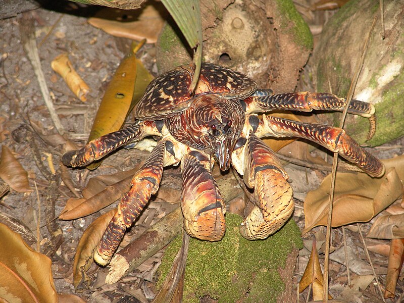
The coconut crab was my other main source of inspiration, mostly for the colour scheme and for the Skollcrabb's elderly form. Coconut crabs are the largest arthropods on the planet, measuring up to 1 meter from leg to leg. They're also known as robber crabs, often known to steal objects from humans living near coasts of Australia. The huge size is what inspired the much taller stature of the elderly Skollcrabb, and it's black, purple and red colour scheme was the main inspiration for the Skollcrabb's "real" colours.
FICTIONAL
Their were a few fictional creatures that inspired the Skollcrabb, most notably Tamatoa from 2016's Moana and some of the crab inspired Pokemon from the Pokemon series.
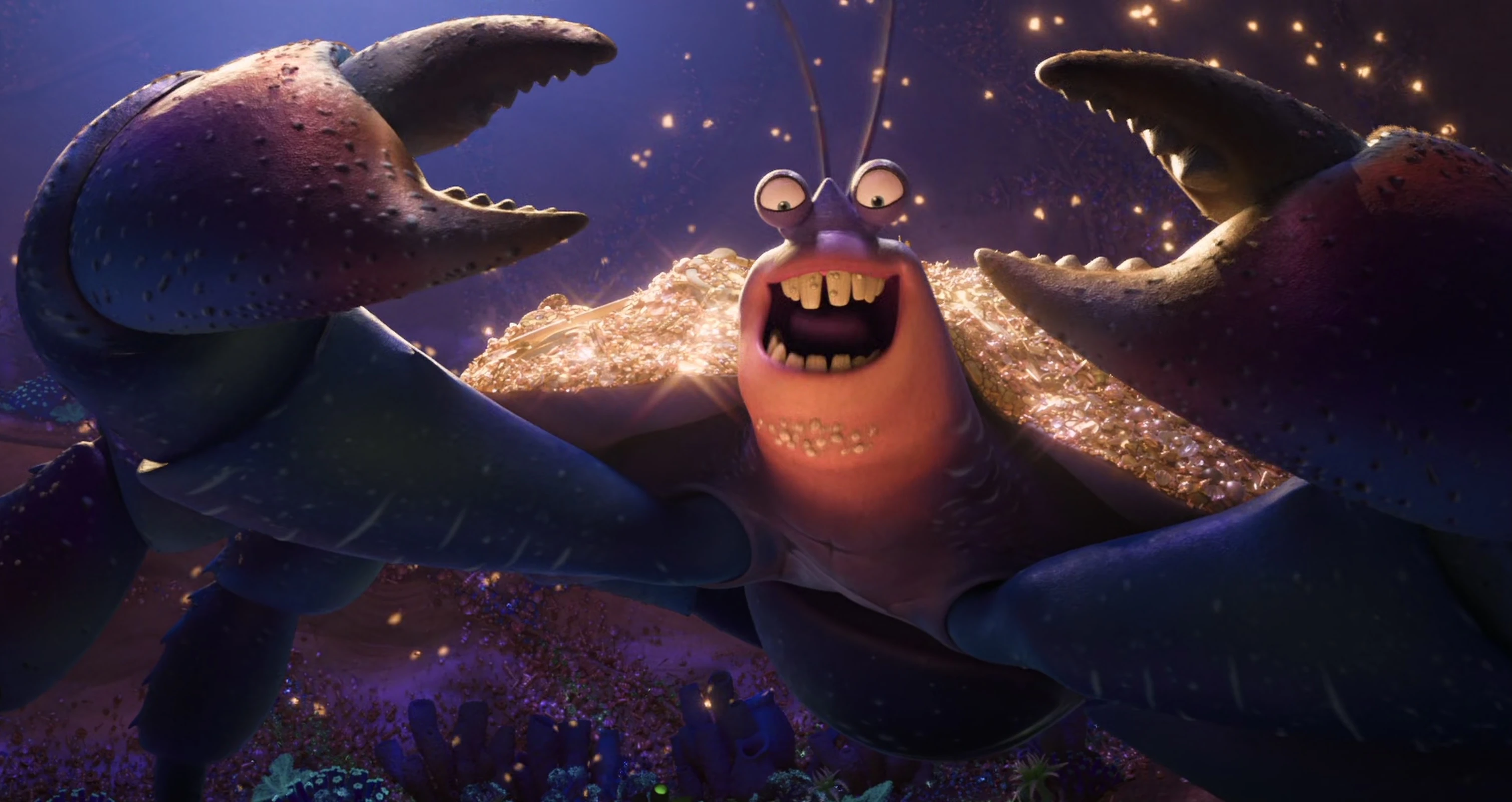
Tamatoa is a giant coconut crab from Disney's 2016 animated film Moana. He acts as a deutagonist, acting as a mini-boss of sorts to get Maui's magical fish hook back. Tamatoa is a fan of gold and shiny objects (evidenced by his collection on his shell, as well as a David Bowie inspired song about it.), referencing the hoarder-like qualities the real coconut crab has. This colour scheme is more close to what inspired the Skollcrabb's colours


Some Pokemon from the Pokemon video game series also inspired the Skollcrabbs. Most notable are (from left to right, top to bottom) Dwebble, Crustle, Paras and Parasect. They all feature very bug-eyed with very large, characterised shells (bar Paras). The claws and legs for the Skollcrabb were inspired by these pokemon as well, having quite thin legs with VERY large claws, which are somewhat rounded.
BIOGRAPHY
Species name: Skollcrabb
Subphylum: Crustacean
Average life expectancy: 150-200 years
Habitat: Deep ocean trenches
Diet: Herbivore (eats mostly seaweed)
Characteristics: Purple exoskeleton with black legs & "cuffs", naturally formed shell resembling a human skull
Gender differences: Males have round heads and consistently shaped shell teeth, females have pointed heads with larger shell fangs
Life-cycle: Start as small shrimp-like creatures, always born two at a time. Babies are carried around by the father, who supports them in his shell's eye sockets. Baby life usually lasts about 6 months. Babies are recognised as adults once their eye stalks retract and their shell develops. Adult life usually lasts about 125 years. As they approach old age, their shell's teeth start turning gold, large seaweed beards form, and their legs and shell's bottom jaw grow out, creating a much taller stature. Older Skollcrabbs usually keep their claws inside their shells. Elderly life usually lasts 50 years.
Predators: Unknown
Evolutionary advantages: Skull shells designed to be retracted into, with a look warding off potential predators into thinking a bigger fish is around.
INFLUENCES
REAL CREATURES
Two main creatures influenced the Skollcrabb; the hermit crab and the coconut crab.
Hermit crabs are decapod crustaceans with the trait of adopting shells of their own to live in by, effectively, stealing it. Shells become more in demand as the crabs grow, and fights can occur between hermit crabs who want the same shell. The strong correlation between crab and shell was my main draw from the hermit crab, especially given how much they mean to them.
The coconut crab was my other main source of inspiration, mostly for the colour scheme and for the Skollcrabb's elderly form. Coconut crabs are the largest arthropods on the planet, measuring up to 1 meter from leg to leg. They're also known as robber crabs, often known to steal objects from humans living near coasts of Australia. The huge size is what inspired the much taller stature of the elderly Skollcrabb, and it's black, purple and red colour scheme was the main inspiration for the Skollcrabb's "real" colours.
FICTIONAL
Their were a few fictional creatures that inspired the Skollcrabb, most notably Tamatoa from 2016's Moana and some of the crab inspired Pokemon from the Pokemon series.
Tamatoa is a giant coconut crab from Disney's 2016 animated film Moana. He acts as a deutagonist, acting as a mini-boss of sorts to get Maui's magical fish hook back. Tamatoa is a fan of gold and shiny objects (evidenced by his collection on his shell, as well as a David Bowie inspired song about it.), referencing the hoarder-like qualities the real coconut crab has. This colour scheme is more close to what inspired the Skollcrabb's colours
Some Pokemon from the Pokemon video game series also inspired the Skollcrabbs. Most notable are (from left to right, top to bottom) Dwebble, Crustle, Paras and Parasect. They all feature very bug-eyed with very large, characterised shells (bar Paras). The claws and legs for the Skollcrabb were inspired by these pokemon as well, having quite thin legs with VERY large claws, which are somewhat rounded.
Monday, March 18, 2019
FANTASTICAL CREATURES - BRIEFING
This session introduced us to our newest character design unit, looking at our own Fantastical Creatures.
This task is to teach us how to create our own characters and then create a 3D version of it, either as a puppet or a CG model; I will be going with the latter.
Our list of deliverables this time includes:
Since I'm working in CG (specifically in Maya), the list of things we'll be doing for the process of designing our creatures is:
This unit will be 5 weeks of term time (+3 weeks of holiday time), of which 4 of those weeks will be CG specific. There will be taught sessions, as well as independent work and research into the animal form, design iterations and process.
After getting all this down, our tables of 4 got a large sheet of paper, and we got to create as many creatures as we wanted! Using different materials and colours was encouraged, so I tried to use as much as felt necessary.

I tried making my creatures look like they'd fit in with my style, but also tried venturing out with the weird creatures idea. I haven't designed creatures in quite a few years, so it was a fun time going back to it!
After we all finished our creatures, we went around the room, putting hearts on which creature one person designed we liked the most. When I got back, I found two with an equal amount of likes: Steveñ the Screaming Mushroom Mutant and Skollcrabbe. And I've got to say, I certainly really like Skollcrabbe too! Steveñ, as funny a design as it is, just doesn't feel like a good fit for this task. I think I'm going to go with Skollcrabbe going forward with this task.
Next session, we're moving on to sculpting our creature out of wire and Super Sculpey, which sounds like it could be really cool! This session, in all, was really fun! It was nice to get back to 2D drawing and making whatever characters we wanted.
This task is to teach us how to create our own characters and then create a 3D version of it, either as a puppet or a CG model; I will be going with the latter.
Our list of deliverables this time includes:
- Turntable - a clip of our creature turning around
- Composited photos - 3 edited photos of our creatures incorporated into provided backgrounds
- Cast sheet - a cast sheet of creatures with a block background
Since I'm working in CG (specifically in Maya), the list of things we'll be doing for the process of designing our creatures is:
- Modelling
- Basic Sculpting
- Retopologizing
- UVs
- Texturing
- Rendering
- Compositing
This unit will be 5 weeks of term time (+3 weeks of holiday time), of which 4 of those weeks will be CG specific. There will be taught sessions, as well as independent work and research into the animal form, design iterations and process.
After getting all this down, our tables of 4 got a large sheet of paper, and we got to create as many creatures as we wanted! Using different materials and colours was encouraged, so I tried to use as much as felt necessary.
(My creatures (from top left clockwise), Johnathon, Camelelelelol, Skollcrabbe, Stabcat, Buzzcut, Lil' Boi, Steveñ, Bjord and DigDog.)
I tried making my creatures look like they'd fit in with my style, but also tried venturing out with the weird creatures idea. I haven't designed creatures in quite a few years, so it was a fun time going back to it!
After we all finished our creatures, we went around the room, putting hearts on which creature one person designed we liked the most. When I got back, I found two with an equal amount of likes: Steveñ the Screaming Mushroom Mutant and Skollcrabbe. And I've got to say, I certainly really like Skollcrabbe too! Steveñ, as funny a design as it is, just doesn't feel like a good fit for this task. I think I'm going to go with Skollcrabbe going forward with this task.
Next session, we're moving on to sculpting our creature out of wire and Super Sculpey, which sounds like it could be really cool! This session, in all, was really fun! It was nice to get back to 2D drawing and making whatever characters we wanted.
Sunday, March 17, 2019
WEEK 12 SUMMARY
WEEK STARTING - 11th of March, 2019
WEEK ENDING - 17th of March, 2019
MONDAY - Mystery Box workshop
Original post: https://ncarolannua1b.blogspot.com/2019/03/mystery-box-maya-session-4.html
TUESDAY - Media Roles introduction
Original post: https://ncarolannua1b.blogspot.com/2019/03/media-roles-introduction.html
"Overall, I'm a little bit more enthusiastic about this research task than the other two, mostly because I hated doing the essays. This allows for a bit more creativity, even if it is just in a powerpoint form. But I'm not so sure about the group angle. I've known for a while I need to improve on working in a group, and I feel like I've achieved that for the most part in other animation tasks. But this group in particular has me a bit concerned. There doesn't seem to be anyone desperate to jump straight into the project, and it feels like we still need time to get to know each other. But only time will tell."
[NOTE: Weekly summaries aren't needed for this project.]
THURSDAY - Mystery Box workshop
Original post: https://ncarolannua1b.blogspot.com/2019/03/mystery-box-maya-session-5.html
"By the end of this session, I got my main blocking all done! Max now has all his basic movements down, and with a couple more tweaks, he should be ready for splining! Those tweaks, along with things I fixed today, were done with the animation timeline editor. It's a really useful tool, and I'm glad we managed to learn how to use it to our advantage!"
SUMMARY
The Mystery Box project this week didn't have anything major happen; I started again from scratch, but that's about it. I think that Jon's tip to do this was the best course of action; if the way I was doing it would only end up causing me more issues than anything else. I managed to translate the same blocking from my previous version over to the new file, but making the necessary changes I needed to make sure I didn't end up recreating the mistakes that got me here. But this week has proved one thing to me, and it's 3D animation is more tricky than my first experiences lead me to believe it is.
Thursday, March 14, 2019
MYSTERY BOX - SESSION #5
This post is looking at another Mystery Box CG session.
Before we got on with our work, we were shown how the animation timeline works more thoroughly. The timeline in animation mode, when selecting a certain element that's able to be animated, will show a series of strings and lines that represent different aspects of how that part is moving. For example, a line going up when looking at the "TranslateY" attribute signifies the object is moving upwards.
There's processes to change the line type of your animation too, being able to switch from stepped to splined, among other combinations. These are going to be necessary later on, since Max needs to move smoothly and without just teleporting to places.
By the end of this session, I got my main blocking all done! Max now has all his basic movements down, and with a couple more tweaks, he should be ready for splining! Those tweaks, along with things I fixed today, were done with the animation timeline editor. It's a really useful tool, and I'm glad we managed to learn how to use it to our advantage!
Tuesday, March 12, 2019
MEDIA ROLES - INTRODUCTION
In this session, we were introduced to our new research project, about media roles. This research task is a different to the last two, in that the deliverable this time around is a group presentation, not an essay.
This is a 6 week project, in which we research into media roles & practices. This can involve looking at certain studios, productions, practitioners and/or techniques. Our blogwork for this will be solo (we'll all be marked for our individual work). This project involves attempting contact with a practitioner in the industry, and in the end showing our group's findings.
The deliverables include:
The presentations have to be visually appealing; make them look pretty! They should be no more than 20 slides, containing an intro, quotes from practitioners, a conclusion and a bibliography. Spelling and grammar are also important to consider.
So what's the aim of this project? It's mostly to familiarise us with the roles that are out there, and to make us think more about our own employability. We should be considering what we want to go into after graduation, and researching the roles out there is a good way of learning the intricacies of potential jobs.
We got put into our groups after this presentation; I'm with 4 people I don't know at all; Jacob, Tom, Tanje and Gareth. The set date for the presentations is the 30th of April, so that's just about 5 or 6 weeks away.
We got another presentation after learning who we were with, this time looking at the different animation disciplines and production types we can look at.
It started with "traditional" animation productions, that being animated films and television shows. There are three types of these features; 3D animated (e.g. Toy Story 3, Star Wars: The Clone Wars), 2D animated (e.g. Aladdin, Gravity Falls) and stop motion (e.g. Wallace and Gromit, Robot Chicken). We then looked further into that looking at the different age groups that watch specific productions.
We finally looked at VFX, where animated characters and effects are applied on top of live action footage.
We then split off into our groups, and decided what we'd look at for our presentations. To put it bluntly, our group's chemistry is non-existent at this point. None of us knew each other, so we didn't have any kind of reference point to go by in terms of what we know already. Eventually we settled on character design after deciding we all liked, and I quote, "character stuff".
We wrote down a list of potential subtopics from the character design angle we could look further into, as well as characters we'd want to look at.


Overall, I'm a little bit more enthusiastic about this research task than the other two, mostly because I hated doing the essays. This allows for a bit more creativity, even if it is just in a powerpoint form. But I'm not so sure about the group angle. I've known for a while I need to improve on working in a group, and I feel like I've achieved that for the most part in other animation tasks. But this group in particular has me a bit concerned. There doesn't seem to be anyone desperate to jump straight into the project, and it feels like we still need time to get to know each other. But only time will tell.
This is a 6 week project, in which we research into media roles & practices. This can involve looking at certain studios, productions, practitioners and/or techniques. Our blogwork for this will be solo (we'll all be marked for our individual work). This project involves attempting contact with a practitioner in the industry, and in the end showing our group's findings.
The deliverables include:
- A 10-minute presentation showing our group's findings
- Includes visual aid (images / videos) and vocal aid (actual speaking)
- Research portfolio
- Contains information on what types of roles we'd be interested in when studying or as a career
- 500 word summary
The presentations have to be visually appealing; make them look pretty! They should be no more than 20 slides, containing an intro, quotes from practitioners, a conclusion and a bibliography. Spelling and grammar are also important to consider.
So what's the aim of this project? It's mostly to familiarise us with the roles that are out there, and to make us think more about our own employability. We should be considering what we want to go into after graduation, and researching the roles out there is a good way of learning the intricacies of potential jobs.
We got put into our groups after this presentation; I'm with 4 people I don't know at all; Jacob, Tom, Tanje and Gareth. The set date for the presentations is the 30th of April, so that's just about 5 or 6 weeks away.
We got another presentation after learning who we were with, this time looking at the different animation disciplines and production types we can look at.
It started with "traditional" animation productions, that being animated films and television shows. There are three types of these features; 3D animated (e.g. Toy Story 3, Star Wars: The Clone Wars), 2D animated (e.g. Aladdin, Gravity Falls) and stop motion (e.g. Wallace and Gromit, Robot Chicken). We then looked further into that looking at the different age groups that watch specific productions.
(The trailer for Pixar's Toy Story 3 - credit: Pixar Animation Studios)
Then we delved into more specific animation types and productions, including TV idents and adverts.
(Channel 4's 2018 idents, involving a giant made up of the blocks from the channel's logo - credit: Channel 4)
There was also a brief look at Virtual Reality and Augmented Reality, and how animated stories can be told with the viewer able to fully explore the world it's happening in. Related to this is video game animation, specifically in cutscenes.
(Cutscenes from Valve's Portal 2, pertaining to space - credit: Valve)
We finally looked at VFX, where animated characters and effects are applied on top of live action footage.
(Framestore's VFX reel for their work on Avengers: Infinity War - credit: Framestore, Marvel Studios)
For the final part of the presentation, we learnt more about the animation industry in the UK. The facts and figures are a lot more surprising than I expected; there are 10,000 people in the UK working in animation, with a 60:40 male to female ratio. 50% of animators are freelance, meaning they get a lot more freedom and choice in their work. But the most surprising thing to me was learning there's a skill shortage. Animators, storyboarders and production staff / management are in desperate need; shocking to me because I expected there to not be enough jobs.We then split off into our groups, and decided what we'd look at for our presentations. To put it bluntly, our group's chemistry is non-existent at this point. None of us knew each other, so we didn't have any kind of reference point to go by in terms of what we know already. Eventually we settled on character design after deciding we all liked, and I quote, "character stuff".
We wrote down a list of potential subtopics from the character design angle we could look further into, as well as characters we'd want to look at.
Overall, I'm a little bit more enthusiastic about this research task than the other two, mostly because I hated doing the essays. This allows for a bit more creativity, even if it is just in a powerpoint form. But I'm not so sure about the group angle. I've known for a while I need to improve on working in a group, and I feel like I've achieved that for the most part in other animation tasks. But this group in particular has me a bit concerned. There doesn't seem to be anyone desperate to jump straight into the project, and it feels like we still need time to get to know each other. But only time will tell.
Subscribe to:
Posts (Atom)